The IRP platform comes mobile-ready — it provides you with a world-class, intuitive and appealing integrated mobile site. Whatever internet-enabled device consumers are using, they will easily reach your business.
If a consumer is using a mobile device to search for a term and finds a link for the main desktop version of your site in their search results, they will be redirected automatically to your mobile site when they click the link. The IRP immediately identifies that the visitor is using a mobile device to view your website and expertly serves the correct mobile versions of every page.
There are many aspects to the IRP mobile offering. Much of it happens automatically and seamlessly, based on the standard (desktop) version of your site, but there are also areas where you have control over how items are displayed, how menus operate and so forth. This help topic provides examples of some of these areas.
IRP mobile device detection
The IRP identifies mobile devices by examining the user-agent strings associated with each category of mobile device (phone or tablet).
IRP Admin includes a Mobile Detection Strings feature in the Server Management section where you can view and configure the user-agent strings — however this information is primarily of use to development and support staff as many of the details are quite technical. The data can be useful to other suitably-skilled staff examining, for example, customer orders.
For full details, see the Mobile Detection Strings help topic.
IRP mobile Application Settings
There are several Application Settings on the IRP back end that you can set for the mobile version of your site. You can find these settings under Application Settings > Mobile Settings in the IRP Admin left navigation menu. You use the Mobile Settings section to define the following aspects of your mobile site:
| Setting |
Description |
| Enable Mobile Site |
This is the master switch for making the mobile version of your website available to all visitors and potential customers. Make sure that you check this box to automatically redirect users who are viewing the site on mobile devices to your mobile site. |
| Enable Expandable Mobile Basket Link |
Check this box to enable the mobile basket link to cause the screen to slide sideways (or ‘fly out’) to reveal the basket contents, instead of redirecting immediately to the basket page. See IRP Mobile Basket Page for details. |
| Enable Mobile Menu |
Check this box to enable navigation on the mobile site as an expandable left-side menu appearing in the top-left corner of the mobile site. When you check this box, the ‘Show Menu Offers Link’ setting and the ‘Menu Starting Category Level’ setting automatically become available to you (see below for details). If you disable this setting, you can make sure that the brand and category drop-down lists are displayed (in order to provide your visitors with an alternative means of navigation) by enabling the ‘Show Brand Dropdown’ and ‘Show Category Dropdown’ settings. See IRP Default Mobile Home Page for more details. |
| Enable Show Mobile Site Links |
Check this box to enable a link for the mobile site to be displayed at the bottom of all standard site front end pages (when those pages are viewed on a mobile device). When a site visitor clicks the link they will go directly to the equivalent mobile page. |
| Menu Starting Category Level |
If you select ‘Department’, a link will be displayed on the mobile menu which, when you click it, will link through to a list of categories. If you select ‘Sub-Department’, the sub-categories will be displayed in the mobile menu immediately alongside the link for brands and (optionally) promotional offers when it is first opened. |
| Show Menu Offers Link |
Check this box to display a link to the Offers page in the mobile menu. |
| Show Brand Dropdown |
Check this box to display the brand drop-down list on all mobile pages. |
| Show Category Dropdown |
Check this box to display the category drop-down list on all mobile pages. |
| Show Mobile Homepage Brand Category Selection |
Check this box to display a structured menu on the mobile home page that contains links to all active brands and categories. |
| Show Top Settings Link |
Check this box to display a link for a visitor to change their country, currency and language settings in the mobile top navigation. The link takes the form of a flag associated with the visitor’s current settings. When a visitor clicks the flag icon, they can select their country, currency and language from drop-down lists. Note: even if you don’t check this box, a link for changing these settings is always displayed in the mobile bottom navigation. See the IRP Mobile Site Settings Page section for details. |
| Show Mobile Filter Menu |
When enabled an Ajax filter menu will display on the mobile site. This functions in the same way as the desktop site left nav attributes menu but is designed for mobile browsing. |
| Enable Add To Basket Direct From Mobile Listings |
This will determine if it is possible to add items to your basket from all listings pages directly instead of having to go onto the models page to do so. |
| Mobile Default List Style |
This setting determines the default style for new customers of mobile listing e.g. Category page:
- Single - One product per line.
- Two Across - Two products per line.
- Three Across - Three products per line, restricted to product images only. |
| Show Mobile More Info Link In Product Lists |
If enabled, a 'View Product' link/button will display below the main product information in product listing pages. This link can be used as a simple prompt to click through to the product in question, or can be configured to show the exact number of child stock items available within a product. The small translations related to this Application Setting are as follows:
- 2659 - View {0} Options
-2660 - View Product
By default, if a product has more than 1 stock item, the 'View {0} Options' link will be shown. If a product only has 1 stock item, then the 'View Product' link will be shown. If you do not wish to display the count of children stock items, simply delete the contents of Small Translation ID 2659 all products will default to the 'View Product' link. |
If you make any changes in this section, make sure that you click the Update Mobile Settings button for your changes to take effect.
Note also that there are additional Application Settings under the following groupings on the ApplicationSettings.aspx page:
| Setting |
Description |
| 'Mobile Site' grouping |
| Automatically Redirect Desktop Users From Mobile Site |
When this is enabled, non-mobile devices attempting to view the mobile site will be redirected to the desktop equivalent of the page. Note that mobile page previews are not redirected when you use the IRP Admin 'Preview' functionality (available on, for example CustomContentPages.aspx, Promotions.aspx, InterventionEdit.aspx, SplitTestEdit.aspx and so forth) and that if an IRP Admin 'Preview' link is used to preview a mobile page, the Admin User's site session will not adhere to the mobile site redirect until browser cookies are cleared. |
| Enable Mobile Menu Brand Links Ordered By Best Selling |
When enabled the first 10 brands in the mobile menu brands list will be the best selling brands. When disabled all brands in the mobile menu will be ordered alphabetically. |
| Enable Mobile Menu Category Links Ordered By Display Order |
When enabled the mobile menu category links will be ordered by the category display ordering. When disabled the links will be ordered alphabetically. |
| Enable Fixed Top Navigation Mobile |
When enabled, the top navigation on the mobile site will remain fixed to the top of the screen when scrolling. |
| Enable Mobile Models Image Zoom Popup |
When enabled, a modal popup will display on the mobile site when double tapping model images. When disabled, the modal popup will not display and double tapping the inline model image will zoom in on the image instead. |
| Mobile Product Data List Size |
This is the number of products to display on the mobile site listing pages by default. |
| Mobile Search Bar Display Option |
This determines which display style to use for the search bar of the mobile site:
• Always Hidden: The search bar is always hidden until the customer clicks the search icon. The search icon is always shown and acts as the switch to toggle the search bar on and off.
• Hidden When Scrolling: The search bar disappears as the customer scrolls down the page but the search icon always remains visible. When the customer clicks the search icon, the search bar appears. The search bar will always be shown when the customer is at the top of the page. |
| 'Navigation - Top' grouping |
| Fixed Top Navigation Include Heading Banners |
When enabled, the heading banners on the desktop, mobile and trade sites will be included in the fixed top navigation. This requires the corresponding fixed top navigation to be enabled. |
| Header Mobile Display Style |
This determines which display style to use for the Header area of the mobile site:
• Display Style 1: This is the legacy version of the header.
• Display Style 2: This is the all-new, improved header. |
| 'Add to Basket' grouping |
| Show Part Code in Add to Basket |
When enabled, the Part Code will be displayed on Add to Basket controls on the Models page. |
| NavigationSettings.aspx page |
| Enable Sort By In Mobile Filter |
Here you can set the order of the filters by dragging the Sort By box to where you want it. |
IRP mobile site stylesheet
You define the whole look and feel of the mobile version of your site using the Interface & Design > Mobile CSS Stylesheet section in the IRP Admin left navigation menu. You should be very confident about handling CSS to make edits to the styles.
Any changes that you make in that section will be reflected immediately on the mobile site. You can see how the website will appear on a mobile device by clicking the Preview Mobile Site button. See the Mobile CSS Stylesheet help topic for details.
IRP mobile site favourites icon
The IRP has support for a mobile favourites icon. This is a very useful feature which you are encouraged to use as it allows customers to add your website to the home screen of their smartphone where it will be displayed as an app-like icon showing the image you have created. Customers can then access your site directly by clicking the icon.
When you create a suitable icon you can add it under Interface/Icons/FavoritesIconMobile.png in the Interface & Design section of IRP Admin. The image should be a PNG image with a width and height of 192 pixels. See the Interface Folder help topic for more details.
IRP default mobile home page
The mobile home page (Default.aspx — always redirected to ~/Mobile/) can involve several elements (depending on configuration) as shown in the following mock example:
Some possible elements are as follows (remember that much of the mobile site setup is based automatically on how you have configured your desktop site):
- A Header area right at the top-left corner of the page. This can contain several features – for full details, see the IRP Header help topic. Some key elements include:
- Menu You need to enable the Application Setting ‘Enable Mobile Menu’ to display this. When a customer clicks this link, the menu expands to the right and shows several items in drop-down lists depending on how you have configured the other Mobile Application Settings. (You can also add custom links into the mobile menu, either at the top or bottom of the menu. The link text and URLs are translatable. You can also configure the links to appear only in specific countries. For more details, see the Custom Mobile Menu Links help topic.) If the customer has signed in, they use this menu to log out again. Note that the customer’s name will always appear in the top-right corner of the screen (‘Hello Jane’) even if they have signed out. The visibility of the Sign In link operates as follows:
- When you are logged in, the Sign In link will not be visible, however the My Account and Log Out link will be visible.
- When you are not logged in, the Sign In link will be visible, however the My Account and Log Out links will not be visible.
- If a guest user is logged in and is no longer on a secure page, the Sign In link will be visible.
Note: CSS classes are available for each group of mobile menu links. These can then be styled differently from each other if required. To do this, add the following classes to the Mobile CSS Stylesheet (CssStylesMobile.aspx) and add whatever styling properties and values you require to each class:
- .my-account-menu-link
- .brand-menu-link
- .category-menu-link
- .product-group-menu-link
- .custom-top-menu-link
- .custom-bottom-menu-link
- .offers-menu-link
- A search feature at the top of the page. When a customer types in a search term and clicks the icon, the MobileSearchResults.aspx page is displayed. See the IRP Mobile Search Results Page section for details. Note: The 'form' tag on the Mobile Search has the CSS class 'search-form' so that you can uniquely reference it when styling the Mobile Search via CSS. When you want to style the Mobile Search, simply add the search-form class to the Mobile Stylesheet (CssStylesMobile.aspx) and then add whatever CSS elements you want to that class.
- A site Logo at the top-centre of the page, ideally translated for each of the countries in your system. When a customer clicks this link on any page, they go back to the home page. You define this logo under Interface & Design > Site Logos in the IRP Admin left navigation menu. To create a new logo, select Add New Logo > New Mobile Logo. See the Site Logos help topic for details.
- A 'My Account' link which customers can click to view their account details and loyalty points. They can also log out using a drop-down menu. See the IRP Header and loyalty points help topics.
- A Settings area (shown as a flag image) if you have enabled the 'Show Top Settings Link' Application Setting. When a customer clicks this link they see the Shopping Settings window. The same settings are displayed at the bottom of the page where customers can also click a link called 'Switch to Desktop' to go directly to the main desktop version of your site. See the IRP Mobile Site Settings Page section for details. Also see the IRP Header help topic.
- A wish list icon See the Wish List and IRP Header help topics.
- A basket icon in the top-right corner of the page. When a customer clicks this link they either go directly to the MobileBasket.aspx page or, if you have enabled the ‘Enable Expandable Mobile Basket Link’ Application Setting, the Default.aspx page (always redirected to ~/Mobile/) remains but the screen slides sideways (or ‘flies out’) to expose the contents of the customer’s basket. See the IRP Mobile Basket Page section for details.
- A Mobile Heading banner below the Search bar. You define this logo under Interface & Design > Banners in the IRP Admin left navigation menu. To create a new banner, select ‘Add New Banner’ and for the ‘Banner Location’ setting, select ‘Mobile Heading’. See the Banners help topic for details.
- Brand and Category drop-down lists for navigation (not shown). You need to enable the Application Setting ‘Show Mobile Homepage Brand Category Selection’ to show these.
- A Mobile Home Page banner in the middle, below the Brands and Categories (not shown). This should be country-specific for each country in your system. You define this banner under Interface & Design > Banners in the IRP Admin left navigation menu. To create a new banner, select ‘Add New Banner’ and for the ‘Banner Location’ setting, select ‘Mobile Home Page’. See the Banners help topic for details.
- Bottom navigation at the bottom of the page (not shown). This area might include Mobile Custom Content Pages. You define this area under Interface & Design > Navigation in the IRP Admin left navigation menu, then click the ‘Bottom’ button and select ‘Mobile Site’. See the Navigation – Bottom Mobile Site help topic for details.
- Custom Content Pages at the bottom of the page (not shown). This might include an About Us page, a Contact Us page, a Delivery & Returns page, a Terms & Conditions page, a Privacy Policy and so forth. There should be country-specific versions of all of these pages so that customers from any country in your system can read these pages on their mobile devices. See the Mobile Custom Content Pages section for details.
- Social Media & Payment Processor links (not shown) and ideally third-party validation (for example, Trustpilot).
IRP mobile Login page
The /Mobile/MyAccount/MobileLogin.aspx page is the main login page for new customers to create an account and for returning customers to sign in again. Here is an example:
New Customers need to click the Create an Account button. This takes them directly to the MyAccount/MobileSetup.aspx page. From here they fill in all or some of the following details:
- Email Address and Password
- Billing Address Details (Name and Address)
- Other Contact Information (Daytime & Mobile phone number, Gender and optionally Date of Birth*)
- Security Questions (Secret Question and Answer)
- Email Subscriptions (Subscribe checkbox)
* Note that a customer can enter their Date of Birth only if you have enabled the Application Setting ‘Enable Customer Date Of Birth Entry’.
When the customer clicks the Create New Account button they are taken to the MyAccount/MobileMyAccount.aspx page. See the IRP Mobile ‘My Account’ page section for details.
Returning Customers must enter their email address and password to log in. If they have forgotten their password they can use the ‘I forgot my password?’ feature:
Note that a ‘Log Out’ button will be visible at the bottom of the left menu if you are already logged in. (If it looks like you are logged in but you can't see the Log Out button, you are likely being recognised as a Guest, so simply Log In again and then you will see the Log Out button.)
IRP mobile ‘My Account’ page
The /Mobile/MyAccount/MobileMyAccount.aspx page is the first page that a customer sees when they click the ‘My Account’ link:
From here, the following options are available:
- Track and manage your orders
- View your orders: This takes the customer to the MyAccount/MobileOrderList.aspx page. This is where users can see a list of all their new and completed orders. If they view a specific order, the MyAccount/MobileOrderDetails.aspx page is displayed.
- Change delivery address on your order: This takes the customer to the MyAccount/MobileOrderList.aspx page. This is where users can see the details of an individual order, including the Order ID, Date, Status, Billing and Payment details. Note that order delivery addresses can only be edited if the ‘Enable Live Charging’ Application Setting (‘Payments - Live Charging’ group) is disabled and the order status is still ‘new’.
- Personal information
- Change your name, billing address or phone numbers: This takes the customer to the MyAccount/MobileEditAccountDetails.aspx page. This is where users can make changes to their contact details (other than their email address, which is managed on a separate page). They can also state whether they are male or female.
- Change your e-mail address or password: This takes the customer to the MyAccount/MobileEditPasswordDetails.aspx page. This is where users can update their email address and password. Optionally, they can also enter their date of birth (if you have enabled the Application Setting ‘Enable Customer Date Of Birth Entry’). This can assist your digital marketing endeavours, especially in being able to target your users more specifically.
- Forgotten your Password? Click Here: This takes the customer to the MyAccount/MobilePassword.aspx page. This is the ‘Password Helper’ page where users can reset their password.
- Loyalty Scheme
- View your recent loyalty points transactions: (Visible only if you have the enabled the Points Loyalty Schemes feature.) This takes the customer to the /Mobile/MyAccount/MobilePointsLoyaltySchemeTransactionHistory.aspx page where they can view a full history of their loyalty point usage.
- E-mail Notifications
- Review your E-mail subscriptions and E-mail formats: This takes the customer to the MyAccount/MobileEmailSubscriptions.aspx page. This is where users can update their subscription details and email preferences for any email campaigns that you have available. They can also unsubscribe from any mailing lists.
- View your requested E-mails for Out Of Stock items: This takes the customer to the MyAccount/MobileStockNotifications.aspx page. This is where users can review emails that they have requested regarding out-of-stock items that they are interested in.
- Join Mailing List: This takes the customer to the MyAccount/MobileEmailSubscriptions.aspx page, as described previously.
IRP mobile Search Results page
When the customer enters a term in the search bar at the top of the page and clicks the Search button, the results are displayed on the MobileSearchResults.aspx page. If several results are returned, the screen includes a ‘Sort By’ drop-down list. Here is an example:
The ‘Sort By’ drop-down list includes the following filters:
- Best Selling
- Price — Low To High
- Price — High To Low
- Discount — Low To High
- Discount — High To Low
- Product — A To Z
- Product — Z To A
- Category — A To Z
- Category — Z To A
- Customer Reviews
- Newest
IRP mobile product listings
Customisation options via CSS
CSS changes may be used to hide or display features, for example removing the 'sort by' or 'hover image toggle' options from the main filter bar or, going further, used to completely re-style the product tile layouts. To make this easier, the Mobile CSS file already contains certain commented-out sections of code which can be used to alter display styles. You can find these in your CSS file by searching for 'PRODUCT LISTINGS OPTIONAL'.
Fixed top navigation bar
If the Application Setting Enable Fixed Top Navigation Mobile is enabled (in the ‘Mobile Settings’ grouping on the main ApplicationSettings.aspx page), when the customer scrolls down the page, at a certain point the top nav will decrease in size and the search bar will no longer be visible. Instead a search icon will appear beside the menu icon:
When the customer clicks this icon the search bar will be visible again and vice versa.
Note also that you can use the Fixed Top Navigation Include Heading Banners Application Setting (in the 'Navigation - Top' grouping). When this is enabled, the heading banners on the desktop, mobile and trade sites will be included in the fixed top navigation. This requires the corresponding fixed top navigation to be enabled.
Sticky filter bar
The new filter bar (list style buttons, product image view buttons, sort by drop down and filter button) will stick to the top when scrolled so it will always be visible. If the fixed navigation header is turned on then it will stick below it otherwise it will stick to the top of the screen.
Mobile listing display style defaults and toggle buttons
You define the style of mobile listings pages using the Application Setting Set Mobile Default List Style in the ‘Mobile Settings’ grouping on the main ApplicationSettings.aspx page (alternatively you can use the Mobile Default List Style setting on the MobileSettings.aspx page). Note that the Enable Mobile Menu Application Setting must also be enabled. You can set Set Mobile Default List Style to one of the following values:
Single – one product per line is displayed as in the following example:
Two across – two products per line are displayed as in the following example:
Three across – three products per line are displayed as in the following example:
When a customer is on the brand, category or promotions listing pages, they can easily switch between these three views using the buttons at the top of the screen:
Note that the list style used on the mobile home page and custom content pages will always take the value of the Set Mobile Default List Style Application Setting and customers cannot change this.
Switching between product images
On brand, category and promotions listing pages, customers can switch between the main product image and the hover product image (as defined by the ‘Product Image Order’ configuration on the ModelsEdit.aspx page) by clicking one of the image buttons in the filter bar (these buttons should be updated to reflect your specific product set):
The hover image takes the value of the Application Setting Model Listing Hover Image Index (in the ‘Product Listing’ grouping on the main ApplicationSettings.aspx page) unless a different one has been set against a specific product. If there is only one image against the model, that image will be shown as the main image.
Small Translation IDs 2651 (main image) & 2652 (hover image) can be used here as an alternative to images on the user interface for these buttons. Simply remove the CSS for these background images and add in the text you require via the small translations.
Filter button
If the customer has selected more than one filter, the filter button will show a count of the filters in a red circle with the count inside it in white text:
The filter pop-up window includes a ‘Done’ and ‘Clear All’ button at the bottom:
If the Application Setting Left Nav Attributes Menu Show Sort By Filter is enabled (in the ‘Product Filter’ grouping on the main ApplicationSettings.aspx page), customers can also use the ‘Sort By’ dropdown from within this filter section. We recommend this option is activated to allow customers this option either from this area or directly from the sticky filter bar (UX testing shows some customer demographics do not see an understandable difference between 'sorting' and 'filtering').
You can also find this Application Setting on the NavigationSettings.aspx page in the ‘Product Filters’ section where it is called Enable Sort By In Mobile Filter. Here you can set the order of the filters by dragging the Sort By box to where you want it.
Small Translation ID 2540 can be used here as an alternative to the 'filter' image on the user interface. Simply edit the CSS for this background image and add in the text you require via the small translation.
Add to basket directly from listings
Customers can add an item to their baskets directly from a listing page (instead of having to go to the model page) if the Application Setting Enable Add To Basket Direct From Mobile Listings is enabled (in the ‘Mobile Settings’ grouping on the main ApplicationSettings.aspx page) – this applies to all listing pages except the home page (alternatively you can use the same setting on the MobileSettings.aspx page). The stock options drop-down list, the quantity textbox and the ‘Buy Now’ add to basket button will all be visible, allowing the customer to make their selections and add items to their basket. If Quantity Discounts have been configured for the stock item, they will be displayed below the price. In addition, Part Codes are displayed on screen if the Application Setting 'Show Part Code in Add to Basket' is enabled (in the 'Add to Basket' grouping). Here is an example:
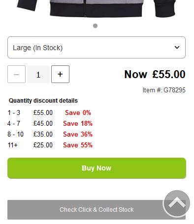
If the customer clicks the Buy Now button without selecting a stock option or entering a valid quantity, the item will not be added to their basket and the stock options drop-down list or quantity textbox will be highlighted to prompt the customer to make those selections.
If the Application Setting Enable Ajax Add To Basket is enabled (in the ‘Add to Basket’ grouping on the main ApplicationSettings.aspx page), when the customer successfully clicks the Buy Now button, the ‘Added To Basket’ confirmation popup window will be shown (displaying the item added and basket total), allowing the customer to either view their basket or to continue shopping:
If the customer clicks ‘Continue Shopping’, the count on the basket in the top nav will be updated. If the Enable Ajax Add To Basket Application Setting is not enabled, the customer will go directly to the basket page when they click the Buy Now button.
Stock requests
If an item is out of stock, customers will see an ‘Out of Stock’ Request Stock Alert link instead of the quantity text box and the add to basket button. When clicked, a popup window will appear which will allow the customer to enter their email address to request a stock alert.
- If the email address field is left empty, an error message will be displayed.
- If the email address entered has already been used to request a stock alert for the item, an error message will be displayed, leaving the popup open to allow the customer to add a different email address.
- If the email address entered has not been used before for the item, a confirmation message will appear and the popup will automatically close after a few seconds.
View Product/Options button
If you want a ‘View Product’ button to appear on the mobile site but not on the desktop site below the main product information on product listing pages, you can use the Show Mobile More Info Link In Product Lists Application Setting (in the ‘Mobile Settings’ grouping on the main ApplicationSettings.aspx page or on the MobileSettings.aspx page).
When enabled, either a simple prompt to click through to the product in question will be displayed or, if applicable, the exact number of child stock items available within a product. This is controlled using Small Translations:
- Small Translation 2659 (‘View {0} Options’) is used to show the product count on the button if there is more than one stock option available (e.g. ‘View 4 Options’). If you don’t want to display the count, simply delete the contents of Small Translation ID 2659 and all products will default to the 'View Product' link.
- Small Translation 2660 (‘View Product’) is used if there is only one stock option.
Reviews
Customers can view and create product reviews on mobile devices in much the same way as they can on desktops and Admin Users can read and approve reviews using the 'Reviews' section of IRP Admin (see Reviews for more information). If an item has reviews against it, the review stars will be visible with a count beside them to show how may reviews there are:
If the customer clicks the stars, they will be redirected to the model page at the reviews section.
To create a new review, the customer can click the 'Write a Review' button:
They will then see the MobileReviewsSubmit.aspx page where they can enter all the information, as described in the Reviews topic.
‘Back to top’ button
Customers will see a ‘back to top’ button appear when they start to scroll down the page:
If they click this button, they will quickly scroll right back up to the top of the page. This button will not be visible when the customer is already at the top of the page.
‘Load More’ button
Customers will be able to see a ‘Load More’ button at the bottom of long listings pages (instead of the normal paging) with a label above the button showing the count of products:
When customers click this button, the next set of products will be loaded below the current list (instead of replacing the current list). If there are no more products to load this button will not be visible.
The amount of products shown on each page can be set using the Mobile Product Data List Size Application Setting.
General features
When a customer selects any brand from one of the drop-down lists, the /Mobile/MobileBrands.aspx page is displayed, showing a list of products associated with the brand that the user has selected.
When a customer selects any category from one of the drop-down lists, the /Mobile/MobileCategories.aspx page is displayed, showing a list of products associated with the category that the user has selected.
When a customer selects a particular product to view from either the brands or categories pages, the MobileModels.aspx is displayed showing that product. The customer can expand and collapse the model description and model reviews content on this page. They can also click (or swipe) through other product images using arrow icons and select another product to view.
The Mobile 'Add To Basket' drop-down control has the following features:
- Brand names are displayed and maintained for branded sites.
- A default stock option is selected only when a single option is available.
- A dash is added between the model and stock option names on the mobile models page.
If the Price Match feature is enabled in the IRP, a ‘Price Match Request’ link is displayed on the MobileModels.aspx page. This links through to the MobilePriceMatchRequest.aspx page. On this page the customer can use a form to request a price match on an item they have seen on another website at a cheaper price. See the Price Match help topic for details.
Viewing model images on mobile
Mobile images carousel
By default, the mobile images carousel control will allow inline zooming on mobile images. Customers can zoom out by pinching on a mobile device or double tapping on the image. The act of zooming will cause the highest resolution version of the image to display (original), whereas the carousel will display the slightly lower resolution 'full' image. The carousel allows swiping between images, tapping left and right arrows, or tapping the location dot/thumbnail:
You can style the carousel by changing the following CSS variables in the Standard Controls Stylesheet (CssStylesStandardControls.aspx):
- --img-carousel-arrow-left
- --img-carousel-arrow-right
- --background-color-carousel-arrow
- --display-carousel-arrow
- --height-image-carousel
- --width-carousel-arrow
The location dots can also have custom styles:
- .standard-component-container .standard-image-carousel .location-dots .location-dot
- .standard-component-container .standard-image-carousel .location-dots .location-dot.selected
When the Enable Mobile Models Image Zoom Popup Application Setting is enabled (the mobile site grouping), double-tapping the image will no longer zoom, instead this will open a full screen modal allowing a larger view of the image. This is enabled globally for all models with images that can be zoomed (where the model Show Image Popup setting is enabled), and is disabled by default. When disabled, the modal pop-up image will not display and double tapping the inline model image will zoom in on the image instead.
Tap to zoom
Mobile users can enlarge a model image by single-tapping the image. If there is one or more images against a product and the setting 'Show Large Image Popup' is enabled against the model in IRP Admin, a 'Tap to Zoom' button will be visible below the image as an instruction to make people aware of this (the enlarged image popup will be shown only if the 'Show Large Image Popup' setting is enabled on the model page in IRP Admin and there is at least one image against the model). (The 'Tap to Zoom' text is translatable via Small Translation 2661.) Also, if they tap the button it will open the popup in the same way that tapping the image does. Once the image has been enlarged, users can zoom in by double tapping or pinching the image and also move the zoomed image to see a specific part of it. There is also the option to swipe to the next/previous image (if there is one provided) or to select a specific image by tapping the small image at the bottom of the screen.
In addition, there is a second view provided: if the user wishes to view all the images at the same time by scrolling down instead of seeing them individually, they can do so by clicking the button at the top of the screen.
Image 'lazy loading'
The IRP supports lazy loading of images across the mobile site, including product listings. 'Lazy loading' means that images are not loaded at page-load time but instead they are loaded as they are needed, for example as they become visible to a customer as they scroll down a web page.
This should help to make your website faster and will also save data, processing time, battery power and other resources.
You enable and disable this feature using an Application Setting called Enable Lazy Image Loading ('General Site Settings' grouping). By default, this is enabled on all sites (desktop, mobile and trade).
IRP mobile Offers page
If you have enabled the ‘Show Menu Offers Link’ Application Setting — and if you have created Promotions in IRP Admin — a link for the offers is shown in the Mobile Menu drop-down list. This links through to the /Mobile/MobileOffers.aspx page which shows a list of all offers that you have available to customers.
Customers can sort the offers using the following filters:
- Best Selling
- Price — Low To High
- Price — High To Low
- Discount — Low To High
- Discount — High To Low
- Product — A To Z
- Product — Z To A
- Category — A To Z
- Category — Z To A
- Customer Reviews
- Newest
In the event that there is no sort-by parameter in the URL, the MobileOffers.aspx page will use the Application Setting 'Sort By Default Offers Page'.
IRP mobile Basket page
When a customer clicks the basket icon at the top-right corner of the page, they go either directly to the MobileBasket.aspx page or, if you have enabled the ‘Enable Expandable Mobile Basket Link’ Application Setting, the Default.aspx page (always redirected to ~/Mobile/) remains but the screen slides sideways (‘flies out’) to expose the contents of the customer’s basket.
The mobile basket ‘fly-out’ page appears as in the following example — you can see how the Default.aspx page (always redirected to ~/Mobile/) has moved to the left to show the basket contents:
There are options for the customer to:
- View Basket: This links directly to the /Mobile/MobileBasket.aspx page.
- Checkout: This links directly to the /Mobile/Secure/MobileLogin.aspx page if the customer has not already logged in. If they are already signed in, the customer will go to the second step of the checkout process, the /Mobile/Secure/MobileDeliveryAddress.aspx page.
- Email Basket: This allows the customer to enter their email address in order to retrieve their basket on any computer on which they open the email link. They also have the opportunity to subscribe to the email list, as shown in the following example:
- (The check box is set according to the Shipping Country setting 'Is Marketing Signup On Account Creation Initially Ticked'.)
The main mobile basket page (/Mobile/MobileBasket.aspx) appears as in the following example:
The page includes similar options to those described previously, including the ‘Checkout’ and ‘Email Basket’ options. Customers also have the opportunity to enter a promotional voucher code if they have one and can enter any additional notes about the order if they wish to do so before they place their order (you can change the default text for this box using Small Translation ID 2525). Note that for the ‘eVoucher Code’ field to be displayed, you must have enabled the Application Setting ‘Enable Voucher Codes’ (in the ‘Promotions And Vouchers’ grouping). You can also alter the default text using Small Translation ID 2516.
IRP mobile Checkout pages
Note: For a detailed description of the IRP checkout on all device types, including screen captures and configuration options, see the IRP Checkout Overview help topic.
When a customer is making a purchase, there are several screens that they will see as they move through the checkout process. After they have signed in on the /Mobile/Secure/MobileLogin.aspx page (if they have not already done so) they will use the screens described below. You can define the bottom navigation in this area under Interface & Design > Navigation in the IRP Admin left navigation menu, then click the ‘Bottom’ button and select ‘Mobile Site – Checkout’. See the Navigation – Bottom Mobile Site Checkout help topic for details.
- /Mobile/Secure/MobileBillingAddress.aspx: On this page the customer has the option to use their current billing address, edit their address or to add a new address.
- /Mobile/Secure/MobilePostage.aspx: Here the customer can select their postage method. Note that if Click & Collect is enabled (and available for the basket contents) the customer will have the option of switching between delivery and collection. Note also that you can set up a shipping message on the mobile site postage page for each Shipping Method available. The .shipping-method-info-row in the Mobile Stylesheet (CssStylesMobile.aspx) is hidden (display:none;), so you can easily change this using CSS elements and style the description in the way that you want.
- /Mobile/Secure/MobilePaymentDetails.aspx: You can configure the order in which payment options appear using the CountryPaymentOptionSettings.aspx page in IRP Admin. For more information, see the Country Payment Settings help topic.
- /Mobile/Secure/MobileOrderSummary.aspx: The customer can see a summary of their order on this page.
- /Mobile/Secure/MobileOrderConfirmation.aspx: This is a very significant page as it presents a major cross-selling opportunity at a point where the customer is susceptible to targeted offers.
IRP mobile Site Settings page
A customer can change the mobile site settings by clicking in the settings area at the bottom of the screen or, if you have enabled the ‘Show Top Settings Link’ Application Setting, the top-right corner of the screen (see IRP Header).
At the bottom of the screen, the customer can see the following settings:
The customer will see both the current language and country. When they click either of these they will see the Shopping Settings window (described below) so that they can change these settings. In addition, below the language and country links is a link called 'Switch to Desktop'. When they click this link, the desktop site will be loaded. This will be visible on all pages except the checkout page.
If the customer clicks the flag at the top of the screen, the Shopping Settings window is displayed, for example:
The following options are available using drop-down menus on this page:
- My country: This allows the customer to select from all of the countries in the IRP.
- My currency: This allows the customer to select from all of the currencies in the IRP.
- My language: This allows the customer to select from all of the languages in the IRP.
- Display prices: This allows the customer to show prices either including or excluding tax. (Displayed only if the 'Allow User Vat Status Changes' Application Setting (in the 'Tax' grouping) is enabled.)
After making the selections, the customer needs to click the Save Changes button and their chosen version of the website is then displayed.
For more details, see the IRP Header help topic.
IRP mobile Custom Content Pages
If you have linked desktop versions of Custom Content Pages to mobile versions, customers can view the mobile versions when they are browsing your site on their mobile devices. The URLs of the pages contain different ID numbers. For example, if the desktop version of your ‘About Us’ page is your-IRP/en/About-Us/cc-1.aspx, the mobile equivalent of the same page might be your-IRP/en/About-Us/cc-6.aspx.
For information about how to create and manage Custom Content Pages, see the Custom Content Pages help topic.
As previously explained, you can define the navigation in this area as described in the Navigation – Bottom Mobile Site help topic.
