You can find this section under Products > Model Customisations in the IRP Admin left navigation menu.
Model Customisations allow you to create customisable product configurations that can be applied to models. T-shirts with image and coloured text, sports equipment with inscribed names and team logos or jewellery with separate front and back inscriptions in different fonts can easily be created.
Pricing can be applied at multiple levels, allowing merchants to price customisations appropriately. The feature has been designed to allow simple to complex customisations to be applied directly to a model or to brand, category or brand-category restrictions.
From Simple to Complex Customisations
Create simple to complex customisations that your shoppers can use to personalise their product selections. The ability for shoppers to customise products is supported in the models page of both desktop and mobile versions of your online stores.
Model Customisation Structure
Each customisation is a template that is built from a nested set of Customisation Groups, Customisation Group Choices and Customisation Group Components.
Using a combination of groups, choices and components a layout can be created that supports simple text inputs to complex layouts with text, images, font styles, colours, multiple sides and previews.
Customisation Example 1 - Simple Text Configuration
Customisation Example 2 - Multiple Text Inputs Configuration
Customisation Example 3 - Complex Mulitple Text and Front/Back Configuration
Creating a Model Customisation
Model Customisations allow for the creation of customisations that can be applied directly to models, brands, categories or brand-category combinations. A customisation includes the flexibility to create layouts and apply pricing at the required levels.
The details in the main Customisations list:
- ID: The ID of the customisation.
- Active: If the customisation is active or inactive.
- Customisation: The name of the customisation that is used to apply to a model.
Adding a Customisation:
- Each customisation is a template that is built from a nested set of Customisation Groups, Customisation Group Choices and Customisation Group Components.
- A new model customisation is added to the IRP before applying the groups, choices and components.
- Select display styles, pricing and custom content page for terms and conditions.
- Pricing may be applied for all active currencies.
Customisation Setup:
- Model Customisation ID: This is the unique IRP identifier for this Model Customisation, added automatically by the IRP.
- Active: Active Model Customisations will be applied to Models where they have been applied directly or Brand and Category restriction have been met. Inactive Model Customisations will not apply at all on the front-end of the site.
- Customisation Name:This name is only used in the IRP Admin so that this Model Customisation can be quickly referenced and identified on the ModelCustomisations.aspx page.
- Price: This is the top level price of the model customisation and can have individual pricing for each active currency. Additional pricing can also be applied to components contained within the model customisation. If no price is required at this level then a 0.00 price value must be set.
- Desktop Display Style: The Display Style to be used on the Desktop Models page for this Model Customisation. Inline Model Customisations will display the customisation control above the Add to Basket button. Overlay Model Customisations will display a customisation button next to the Add to Basket button which will display the customisation control as an overlay slideout when clicked.
- Mobile Display Style: The Display Style to be used on the Mobile Models page for this Model Customisation. Inline Model Customisations will display the customisation control above the Add to Basket button. Overlay Model Customisations will display a customisation button next to the Add to Basket button which will display the customisation control as an overlay slideout when clicked.
- Additional Information: Additional Information is displayed below the terms and conditions checkbox on the customisation control displayed on the Models page.
- Terms and Conditions Custom Content Page: Allows for the selection of a custom content page that is linked to the customised products terms and conditions.
- Date Created: The date and time for the creation of the model configuration.
Adding a Model Customisation Group to a Customisation
- A customisation group is a container for customisation choices and components.
- It may display on the models page with or without a checkbox as part of a selection process.
- Pricing may be applied for all active currencies.
Customisation Group Setup:
- Model Customisation Group ID: This is the unique IRP identifier for this Model Customisation Group, added automatically by the IRP.
- Is Required: Determines if this group is required or not. Groups which are not required will be displayed with a checkbox and can be configured optionally.
- Admin Name: The Admin Name of this group. This will be displayed in the Order Management section and Order Sheets for customised items.
- Label Text: The text which is displayed for this group on the customisation control on the Models page.
- Label Text Basket: The text which will be displayed for this group within the Basket row of the customised item.
- Display Order: The order in which this group will be displayed on the customisation control on the Models page in relation to other groups within this customisation.
- Price: The price of this Model Customisation Group.
A Customisation Group Example with Choices and Components:
Adding a Customisation Group Choice
- Choices allow the ability to determine if groups are displayed as part of a radio button group.
- This may be required where you have a choice of options within a single radio group. E.g. The ability to select a image from one radio group or another.
The details in the main Customisation Group Choice:
- Model Customisation Group Choice ID: This is the unique IRP identifier for this Model Customisation Group Choice, added automatically by the IRP.
- IsSingleSelection: Determines if this Choice is a single selection Choice or not. Single selection Choices will be rendered as a radio option group, where each child Component is a radio option where only one child Component can be chosen and configured.
- Label Text: The text which will be displayed above the radio group options if this Choice has been marked as 'Is Single Selection'.
- Display Order: The Order that this Choice will be displayed on the customisation control on the Models page in relation to other Choices within the Group.
Adding a Customisation Group Component
- Select from component types: Text Box, Colour Selector, Image Upload, Image Selector or None.
- Each component type has different attributes that are displayed on selection.
Customisation Group Choice Component:
- Model Customisation Group Choice Component ID: This is the unique IRP identifier for this Model Customisation Group Choice Component, added automatically by the IRP.
- Component Type: The component type of this Component with options for Text Box, Colour Selector, Image Upload, Image Selector and None.
- Choice Text: The text that will be displayed for this Component on the customisation control on the Models page when the Component is part of a Choice which is 'Is Single Selection'
- IsRequired: Determines if this Component is required or not.
- Display Order: The Order that this Component will be displayed on the customisation control on the Models page in relation to other Components within the Choice.
- Price: The Price of the Model Customisation Group Choice Component.
Component Type - Text Box:
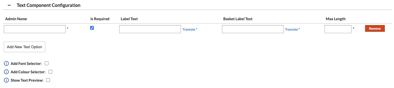
- Admin Name: The Admin Name of this Text Component Configuration.
- IsRequired: Determines if this text component is required or not.
- Label Text: The text which will be displayed above the text component.
- Basket Label Text: The text which will display as a label to the text component on the Basket page.
- Max Length: The maximum number of characters that can be entered in the text field.
- Add Font Selector: Allows for one or more font styles to be added. On the models page the user can select which font style they want to apply to the text component.
- Font Selector Admin Name: The Admin Name of the Font Selector which will be displayed in the Order Management section and on Order Sheets.
- Font Selector Label Text: The text that will be displayed for this Font Selector on the customisation control on the Models page.
- Font Selector Basket label Text: The text that will be displayed for this Font Selector in the Basket row for a customised item.
- Font Display Name: The name of the font.
- Font Family: The font name that is used in the css. It must conform to the correct naming convention that is required within css.
- Font CSS: The location on the font which can either be imports from an external source like Google Fonts or the local location within the IRP.
- Add Colour Selector: Add a Colour Selector to this text component.
- Colour Selector Admin Name: The Admin Name of the Colour Selector which will be displayed in the Order Management section and on Order Sheets.
- Colour Selector Label Text: The text that will be displayed for this Colour Selector on the customisation control on the Models page.
- Colour Selector Basket label Text: The text that will be displayed for this Colour Selector in the Basket row for a customised item.
- Colour Name: The name of the colour
- Colour Hex Value: The hexidecimal value for the font colour.
- Show Preview Text: Show a text preview section for this Text Component.
Component Type - Colour Selector:
- Admin Name: The Admin Name of the Colour Selector which will be displayed in the Order Management section and on Order Sheets.
- Label Text: The text that will be displayed for this Colour Selector on the customisation control on the Models page.
- Basket Label Text: The text that will be displayed for this Colour Selector in the Basket row for a customised item.
- Min Colours: The minimum colours required to be selected by the customer via the customisation control on the Models page.
- Max Colours: The maximum colours required to be selected by the customer via the customisation control on the Models page.
- Colour Name: The name of the colour.
- Colour Hex Value: The hexidecimal value for the font colour.
Component Type - Image Upload:
- Admin Name: The Admin Name of the Image Upload which will be displayed in the Order Management section and on Order Sheets.
- Label Text: The text that will be displayed for this Image Upload on the customisation control on the Models page.
- Basket Label Text: The text that will be displayed for this Image Upload in the Basket row for a customised item.
- Min Image Width (px): The minimum width in pixels required by the image being uploaded by the customer.
- Min Image Height (px): The minimum height in pixels required by the image being uploaded by the customer.
- Max Image Width (px): The maximum width in pixels required by the image being uploaded by the customer.
- Max Image Height (px): The maximum height in pixels required by the image being uploaded by the customer.
Component Type - Image Selector:
- Image Selector Admin Name: The Admin Name of the Image Selector which will be displayed in the Order Management section and on Order Sheets.
- Image Selector Label Text: The text that will be displayed for this Image Selector on the customisation control on the Models page.
- Image Selector Basket Label Text: The text that will be displayed for this Image Selector in the Basket row for a customised item.
- Image Options:
Component Type - None:
- Admin Name: The Admin Name of this component which will be displayed in the Order Management section and on Order Sheets.
- Label Text: The text that will be displayed for this component on the customisation control on the Models page.
- Basket Label Text: The text that will be displayed for this component in the Basket row for a customised item.
Adding a Customisation Product Restriction
- Restrictions can be added to restrict customisations for certain Brands, Categories or Brand-Category combinations.
- Adding Restrictions means only Models which fall into these combinations have customisations applied.
- Restriction Type: Select from Brand, Category or Brand-Category Combination.
Assigning a Customisation to a Model
- Assign a customisation to a model can be found in Products > Models > Other Model Information
- Attributes assigned to the customisation can be overridden at a model level.
- Models can be set as “Is Customisation Required” which forces a Customisation to be applied first before the item can be purchased.
Adding a customisation directly to a model:
- Model Customisation: The name of the model customisation applied to the model
- Model Customisation Display Style Desktop: Determines if the customisation display inherits the selected customisation display settings or can be overridden to display inline or overlay.
- Model Customisation Display Style Mobile: Determines if the customisation display inherits the selected customisation display settings or can be overridden to display inline or overlay.
- Is Customisation Required: Determines if the customisation must be completed of the model before proceeding to add the model to the basket.
IRP Shopper Flows
Shoppers can easily customise products either on desktop or mobile and see the price they have to pay. Select to display customisations inline or overlayed.
- Models Page: Select to customise a product inline or overlayed.
- Basket: View the customised details and select to modify the customisation.
- Checkout: View the customisation details and price throught the checkout flow.
- Confirmation email: View the customisation details directly in the email.
- My Account: View the customisation details directly in the order.
- Promotions: The Promotions engine considers customisation pricing and an “Exclude Customised Products” setting allows customised Models to be excluded from the application of Promotions.
- Order sheets: View the customisation details directly in orders, order sheet templates and default order sheets.
Models:
Baskets:
Checkout:
Confirmation Email:
My Account:
Order Sheet:
